How Project Managers Can Automate Client Reports Using Dashboards + AI
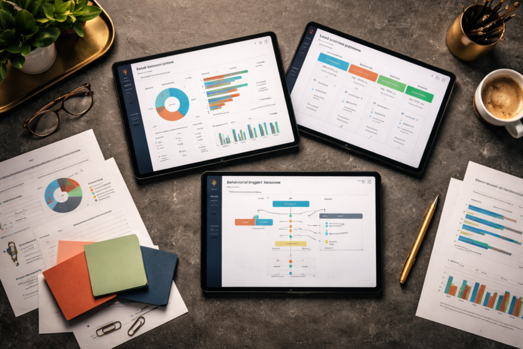
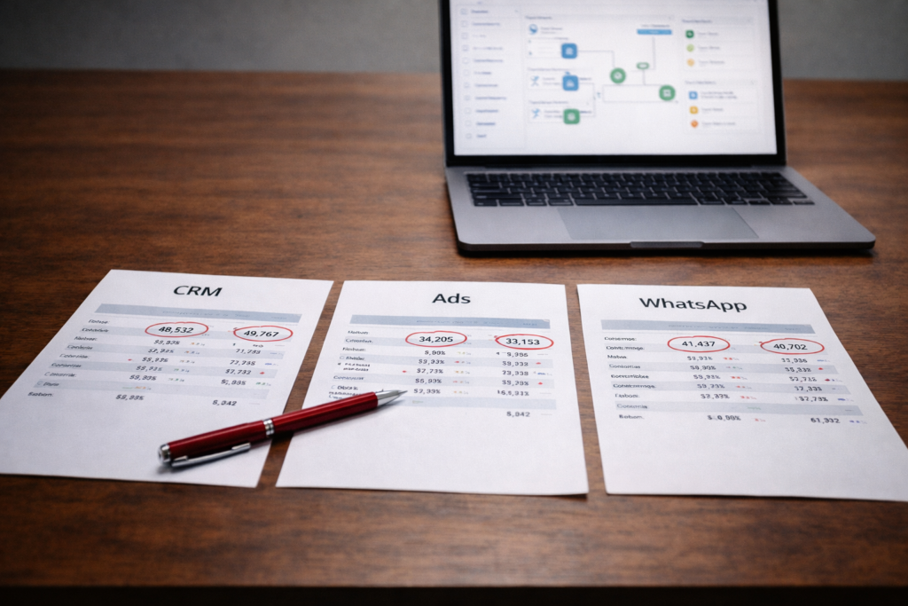
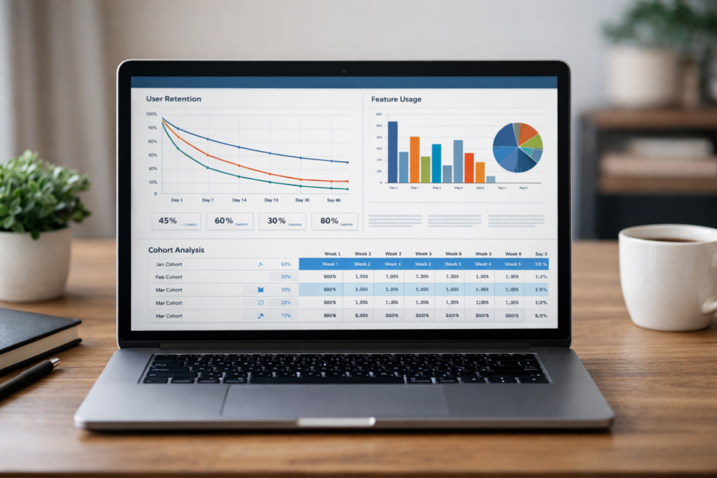
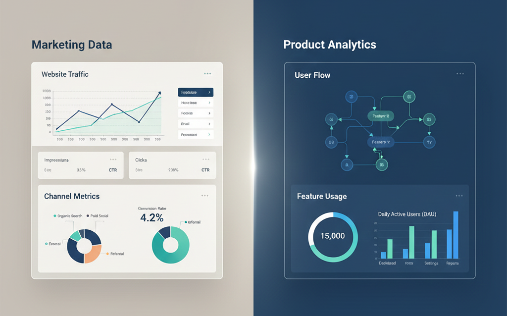
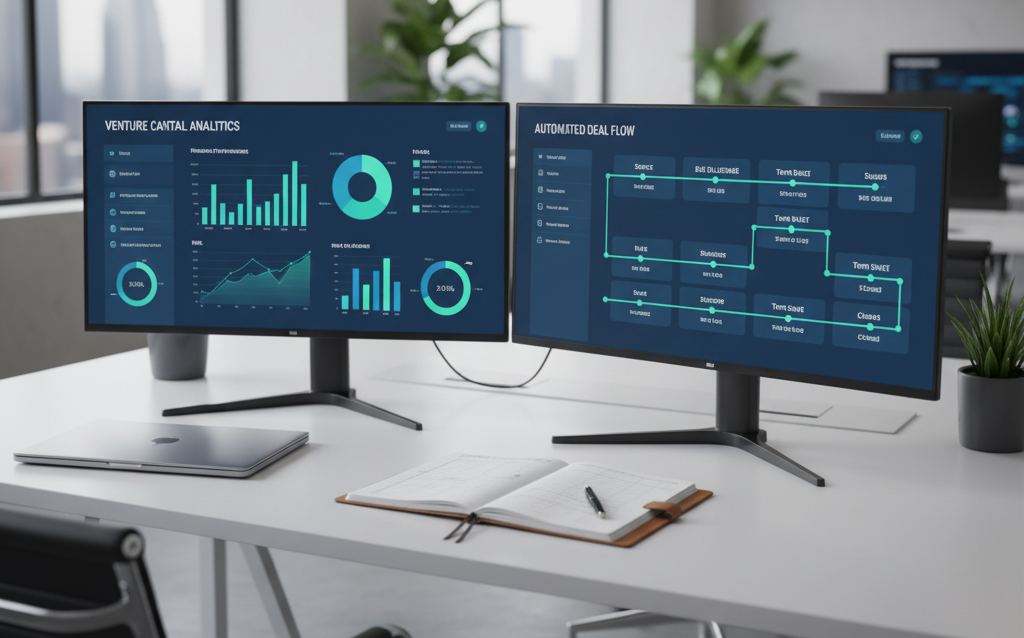
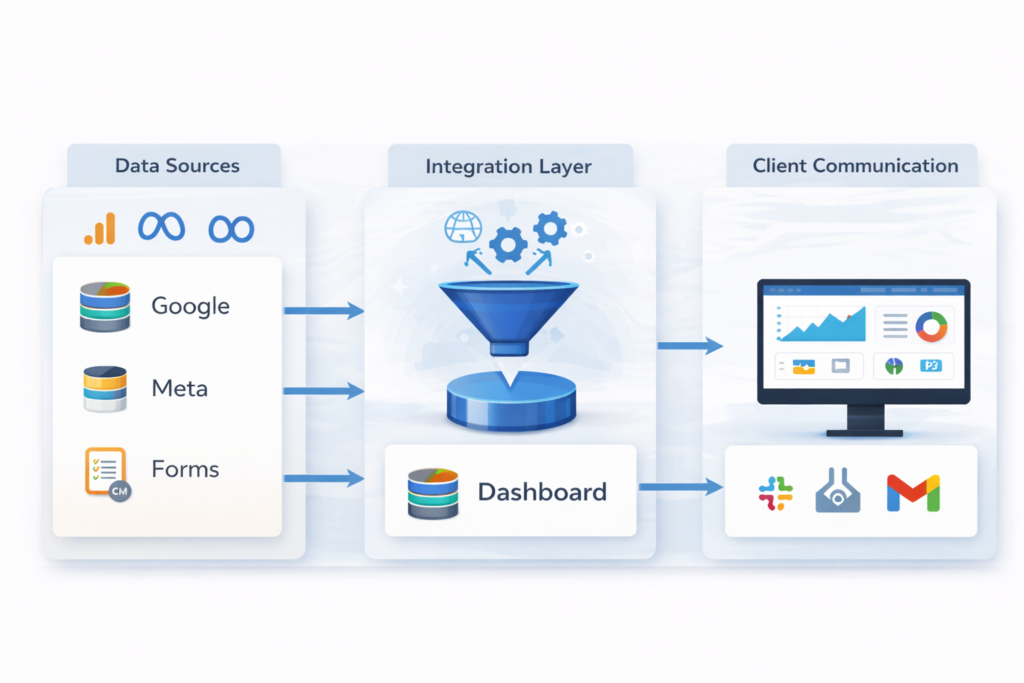
How Project Managers Can Automate Client Reports Using Dashboards + AI A Daily Burden That Slows Delivery For many project managers, reporting is a constant responsibility. It sits between execution and communication. It requires attention, accuracy, and time. Each reporting cycle follows a familiar pattern. Data is collected from different tools. Numbers are verified. Slides or sheets are prepared. Updates are shared with clients. The process works, but it consumes hours that could be used elsewhere. With the rise of structured dashboards and AI tools, this routine is changing. Reporting no longer needs to be rebuilt each time. It can run as part of an ongoing system. Where Time Gets Lost To improve reporting, it is useful to identify where effort is spent. Data Collection Information is pulled from analytics platforms, CRM systems, and campaign tools. This often involves switching between multiple interfaces. Data Preparation Numbers are formatted and arranged. Metrics are selected and aligned with reporting goals. Report Creation Reports are built using spreadsheets or presentation tools. This step requires consistency and attention to detail. Review and Delivery Reports are checked for accuracy before being shared. Any correction leads to repetition. The Shift Toward Automated Reporting Automated reporting changes the structure of this process. Instead of building reports manually, project managers rely on AI-powered dashboards that update continuously. These systems: Pull data directly from source tools Organize information into a fixed structure Present updates in real time This reduces the need for repeated effort. A Comparison of Workflows Step Manual Reporting Automated Reporting Data Collection Manual extraction Direct integration Data Preparation Repeated formatting Predefined structure Report Creation Built each time Always available Updates Periodic Continuous Time Required High Reduced What Makes Dashboards Effective A dashboard is not simply a display of numbers. Its value depends on how it is designed. Clear Metrics Only relevant metrics should be included. This prevents confusion. Consistent Layout Information should appear in the same format each time. This helps users read reports quickly. Real-Time Updates Data should reflect the current state of the system. This reduces delays in decision-making. The Role of AI Tools AI tools enhance dashboards by handling tasks that would otherwise require manual effort. Data Integration They connect multiple data sources and ensure that information flows without interruption. Pattern Recognition They identify trends within the data. This helps project managers understand performance changes. Automated Alerts They notify teams when certain conditions are met, such as a drop in performance. A Pattern Across Different Projects The need for automated reporting appears in many cases. In a project focused on driving growth for a U.S. music application with full-stack analytics, structured dashboards allowed teams to track performance without manual data collection. In another case involving HubSpot setup for a growing fintech brand, dashboards ensured that customer data remained visible across stages. This improved coordination between teams. These examples show that reporting systems are most effective when they are integrated with the broader workflow. How Project Managers Can Start The transition to automated reporting can be gradual. Identify Repetitive Reports Focus on reports that are created frequently. These offer the most immediate benefit. Connect Data Sources Use AI tools for reporting automation to link analytics platforms, CRM systems, and other tools. Build a Basic Dashboard Start with a simple structure that reflects key metrics. Expand as Needed Add more data and features once the system is stable. A Balanced Approach Automation does not remove the need for human judgment. Project managers still play a key role in: Interpreting results Communicating insights Adjusting strategies Automation supports these tasks by reducing routine effort. A Broader Perspective The move toward automated reporting reflects a larger change in how work is organized. Tasks that involve repetition are increasingly handled by systems. Human effort shifts toward understanding and decision-making. For project managers, this shift provides an opportunity to focus on higher-value work. Closing Note Client reporting will always remain an essential part of agency work. What changes is how that reporting is prepared. With the support of dashboards and AI tools, Product Siddha project managers can reduce manual effort and improve consistency. The result is a reporting system that supports both clarity and efficiency.